La simplicité est la clé de l’élégance
Simplicity is the keynote of all true elegance.
Coco Chanel, Harper’s Bazaar, 1923
La simplicité est la clé de l’élégance
Simplicity is the keynote of all true elegance.
Coco Chanel, Harper’s Bazaar, 1923

For the past few months, I’ve been designing Tally*, our custom design system for agentic accounting at Maxima. We’re moving off MUI while still shipping for customers every week. Here’s why we did it, and how we’re doing it.
* Tally /ˈteɪli/ noun, verb : a design system for agentic accounting at Maxima.

MUI served us well. It let a small team ship fast and get product into customers’ hands. As the product grew, we started to see its edges: things it couldn’t support, and places where it no longer gave us value.
We wanted Maxima to look and feel like itself. Our MUI system looked identical to our competitors, and to a lot of other startups as well. Distinction meant reshaping primitives and behaviors, down to small decisions like whether a dropdown menu aligns left or right. In MUI, each of those became a hard-coded exception.
More of our code is now written alongside agents, and they are far more fluent in Tailwind than in a heavily customized MUI. Every override we layered on was one more dialect only we spoke. Tailwind is a language that people and agents already share.
When I joined, the app felt like it had been built by many hands without a common map. Breadcrumbs appeared on one page and vanished on the next. The same component showed up in many different forms. Nothing defined how a layout should work or how a component should earn its place.


 @ajisadesigner
I started with color exploration, alongside my friend AJ, whose color instincts are better than mine and who helped steer us toward a direction that feels right for fintech. We were solving for two things: accent colors that carry status, and a neutral that sits well beside our core brand blue. Color came first because everything else inherits from it, and in a product built around reviewing and approving work, color is less decoration than signal.
Once the core color swatches were set, I turned to structure. I mapped out every inconsistency across the product, then used that map to design a shared layout, so that each module would match the others. Color can make a product look cohesive, but only structure can make it behave that way.
We made over ten font pairings, each giving Maxima a different personality. Type is where a product’s voice comes through, so we tested them internally and chose the pairing that felt modern while staying clear and readable for dense accounting data.
With the visual direction set, I worked with our front-end team to align on how it would be built, and explored which established design systems could help us migrate faster. The aim wasn’t to start from nothing. It was to find the quickest path from MUI to something of our own.
We’re still moving each module over to Tally. Since we’re a small team building a lot of new features and modules at the same time, the migration is gradual, and the system keeps growing as we go.
Accuracy, Clarity, and Speed are the principles guiding it.
I’ll share more as it takes shape.
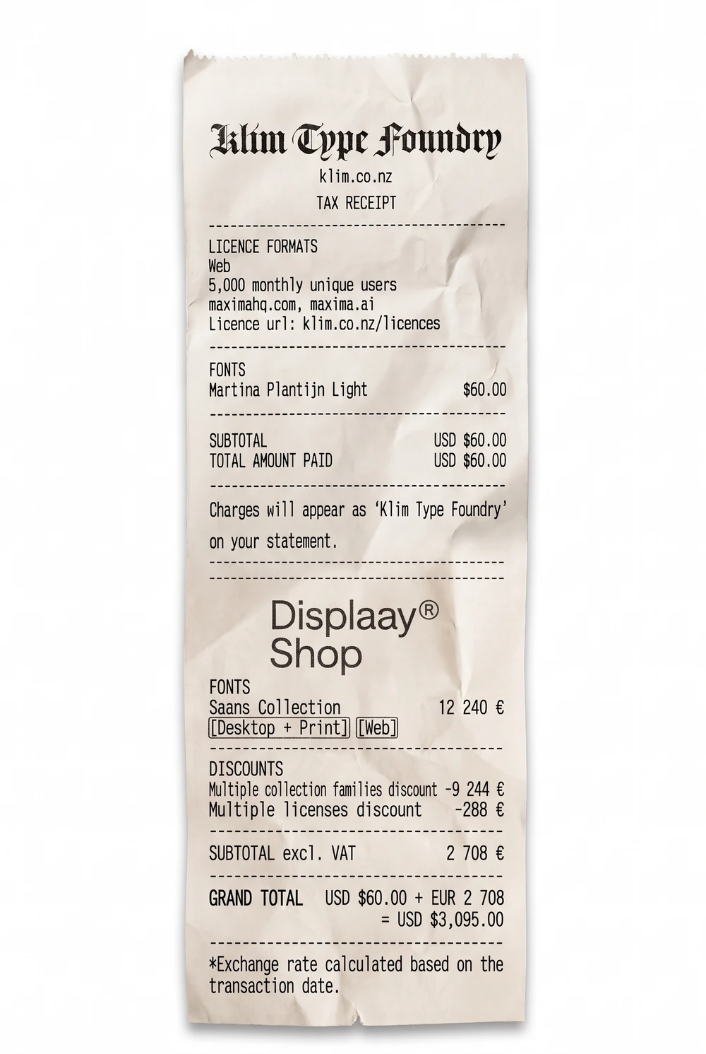
lol my manager AK:
“why are fonts so expensive”


Time is money
Benjamin Franklin 1748


Before Maxima, I'd designed for security teams, IT or software engineers. Dense data, high stakes, power users. They're logical. Give them the data and the controls, and they remember where to find things they need.
Accountants... are a different species. They are careful by nature and skeptical by training. They don't take a number at face value. They want to know where it came from, who touched it, and whether it will still hold up months later when an auditor asks. Their name is on these numbers, and so are the decisions leadership makes from them.
When accountants look at a design, they're measuring it against their own time. How long will this take me? Do I still have to enter things by hand, or can the agent do it for me? If the agent does it, how accurate is it? Can I see exactly what it did, step by step? And if one of those steps is wrong, how do I fix it?

They care about the interface too, just in a very practical way. They want clear visualizations and a screen that never makes them second-guess where to look. Color and contrast matter more than you'd think. Many accountants work on Windows, where colors can look very different from what designers see on a Mac, and subtle shades that look fine in Figma can get lost on their screens. For them, accessible color isn't a nice-to-have. It's part of getting the work right. Statuses have to be just as clear. If a label says "balance change," they need to know right away what it means and whether they have to do anything about it.
Accountants are extremely time-sensitive. Anything that pulls extra attention, like a vague status, an unclear next step, or a screen they have to stop and decode, is a bad experience. Agentic experience (AX) has been a hot topic lately, but I think what it should look like depends on who the AI is working on behalf of.

So much of accounting work is complex in ways that don't fit neatly into buttons and forms, like granting permissions to dozens of people at once, or building a workflow from a pile of source data.
For work like this, a conversational experience powered by an LLM is often the best approach, because it can do far more than execute a command. It can convert files, aggregate data from different sources, analyze a screen recording of how someone does a task today, and generate results that accountants can verify and trust.
Most importantly, it gives people their time back. Every hour the agent spends on the tedious parts is an hour accountants can spend on the judgment calls only they can make.

 time... is Money
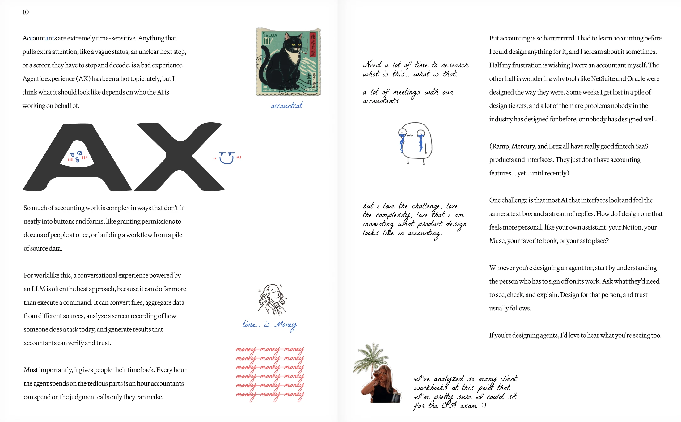
But accounting is so harrrrrrrrd. I had to learn accounting before I could design anything for it, and I scream about it sometimes. Half my frustration is wishing I were an accountant myself. The other half is wondering why tools like NetSuite and Oracle were designed the way they were. Some weeks I get lost in a pile of design tickets, and a lot of them are problems nobody in the industry has designed for before, or nobody has designed well.
(Ramp, Mercury, and Brex all have really good fintech SaaS products and interfaces. They just don't have accounting features... yet.. until recently)
One challenge is that most AI chat interfaces look and feel the same: a text box and a stream of replies. How do I design one that feels more personal, like your own assistant, your Notion, your Muse, your favorite book, or your safe place?
Whoever you’re designing an agent for, start by understanding the person who has to sign off on its work. Ask what they’d need to see, check, and explain. Design for that person, and trust usually follows.
If you're designing agents, I'd love to hear what you're seeing too.
Learning accounting takes a lot of research, and it’s often more complicated than I expected.
ex: a prepaid account can be split between current and non-current depending on how long the service period runs, and account mapping gets complex fast when every company structures its Chart of Accounts differently.

But I love the challenge and the complexity, and I love that I’m helping shape what product design can be in accounting.

I’ve analyzed so many client workbooks at this point that I’m pretty sure I could sit for the CPA exam :)


Summer in New York
iPhone 17, August 2026
Generated with Google Nano Banana
It takes resilience to continue to believe in yourself.
Jensen Huang 2026